

Minimalist vs. Bold Branding: Which Approach is Right for You?
Admin
Both minimalist and bold branding approaches have their place in the design world. Choosing the right one depends on your business objectives and audience.
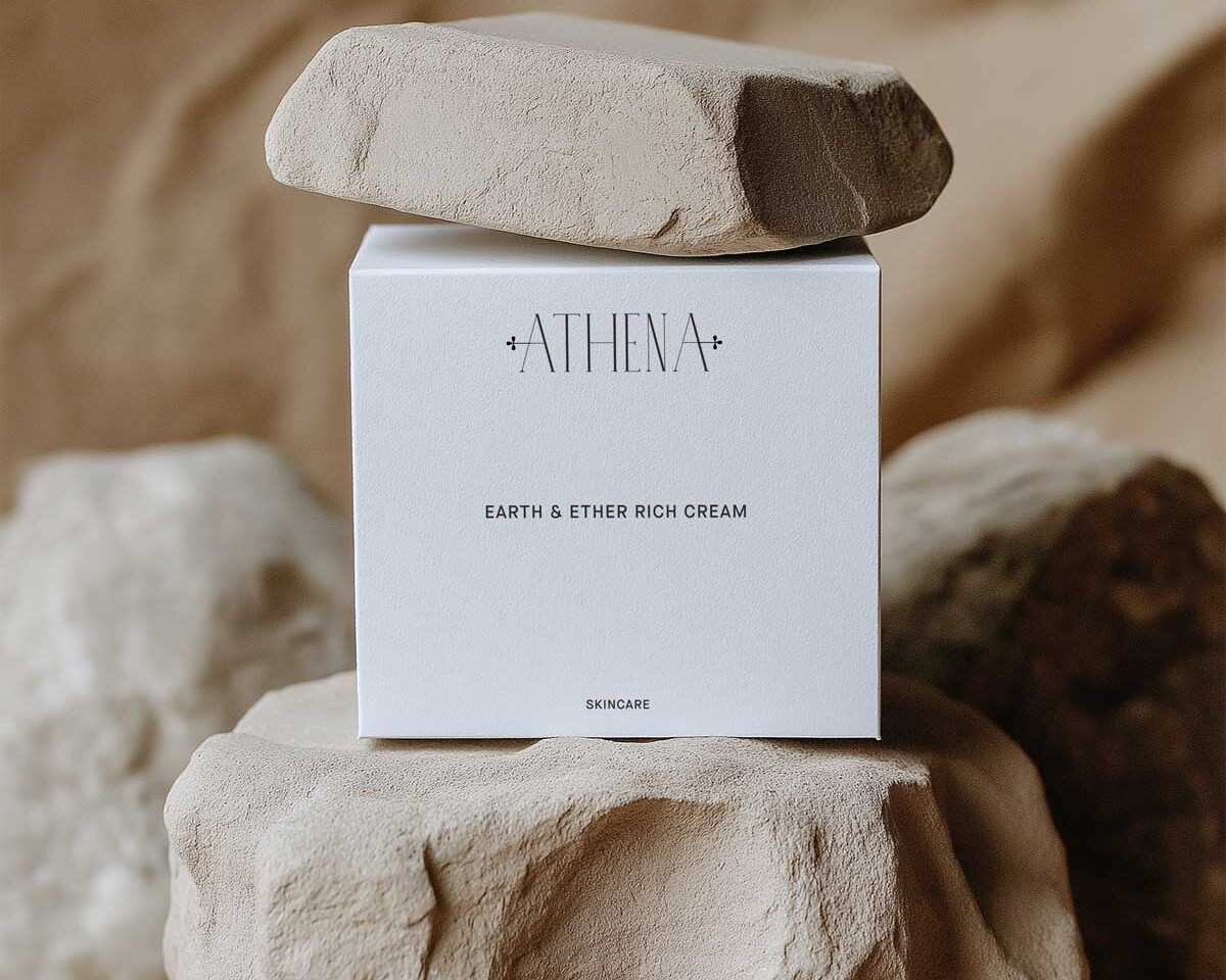
Minimalist Branding
Characteristics: Clean lines, neutral colors, simple typography.
Strengths:
Communicates clarity and sophistication.
Focuses attention on key messages.
Easy to maintain and scale.
Ideal for: High-end brands, technology companies, and businesses that want to convey elegance and professionalism.
Bold Branding
Characteristics: Vibrant colors, daring typography, striking visuals.
Strengths:
Commands attention.
Demonstrates confidence and creativity.
Works well in crowded markets where standing out is crucial.
Ideal for: Startups, creative industries, fashion brands, and youth-oriented businesses.
Finding the Right Balance
Some of the most successful brands combine both styles. For example, Apple’s minimalist design is paired with bold product launches and marketing. Consider your audience, brand values, and industry when choosing your approach.

The Power of Colour in Branding: How to Choose the Right Palette

Admin
Colours have the power to influence human behaviour and perception. The right colour palette can make your brand more recognisable and emotionally resonant.
The Psychology of Colour
Red: Energy, excitement, and urgency.
Blue: Trust, calm, and professionalism.
Yellow: Optimism, warmth, and clarity.
Green: Health, balance, and growth.
Purple: Creativity, luxury, and wisdom.
Black: Power, elegance, and sophistication.
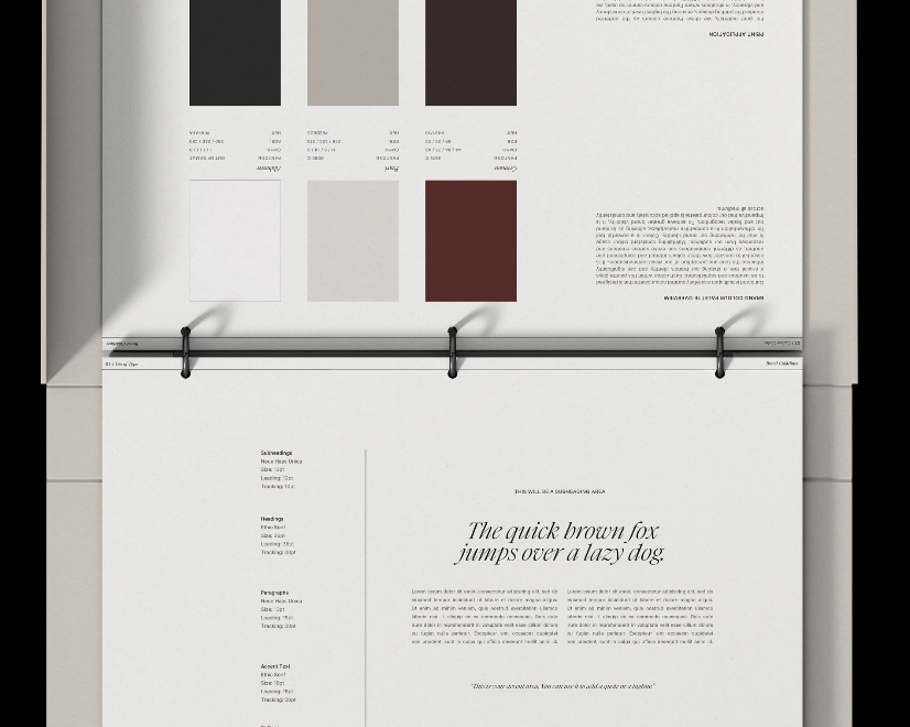
Building Your Brand Colour Palette
Start with a Core Colour: This should be the colour most associated with your brand.
Select Supporting Colours: These add depth and variety but should harmonise with the core colour.
Add Neutrals: Whites, greys, and blacks are essential for balance.
Test Your Palette: Check your palette for contrast and legibility.
Tips for Consistency
Use the same colours across your website, packaging, social media, and advertising.
Create a brand colour guide to ensure uniformity across platforms.
The right colour palette enhances emotional connection and makes your brand memorable.

Typography Matters: Choosing the Right Fonts for Your Brand
Admin
Typography is often overlooked, but it plays a critical role in how a brand communicates visually. The right typography enhances readability, sets the tone, and helps convey your brand’s personality.
The Influence of Typography on Brand Perception
Typography influences how customers perceive your brand before they even read a word. A luxury brand might use elegant serif fonts, while a youthful startup might opt for playful sans-serif typefaces.
Understanding Font Categories
Serif Fonts: Traditional, elegant, and trustworthy. Ideal for high-end brands or professional services.
Sans-Serif Fonts: Clean, modern, and accessible. Perfect for tech companies and minimalist brands.
Script Fonts: Creative, personal, and artistic. Best used sparingly for logos or headers.
Display Fonts: Bold and eye-catching. Use for headlines or callouts to grab attention.
How to Choose the Right Font Pairings
- Start with a Primary Font: This will be the font used for headers and key visuals.
- Add a Complementary Font: Choose something more neutral for body text to ensure readability.
- Limit Your Choices: Two to three fonts are ideal to maintain consistency.
- Test Across Devices: Make sure your font choices are legible on both desktop and mobile.
Typography Best Practices
- Maintain adequate spacing and line height.
- Avoid using too many different font weights.
- Prioritize accessibility by ensuring good contrast.
Choosing typography that aligns with your brand personality can elevate your entire visual identity.

The Psychology of Branding: How to Create a Memorable Brand Identity

Admin
Branding isn’t just about logos and colors—it’s about how a brand makes people feel. A strong brand identity creates an emotional connection, influences customer decisions, and builds long-term loyalty.
Why Branding Matters
People remember how a brand makes them feel more than what it says or does. A well-crafted brand identity builds trust and recognition, making it easier for customers to connect with and return to a business.
Key Elements of a Strong Brand Identity
1. Brand Story – What is the purpose behind your brand? A compelling narrative gives people a reason to care.
2. Visual Identity – Logos, colors, fonts, and design elements create a recognizable look.
3. Brand Voice – The way a brand communicates (formal, friendly, witty, etc.) helps shape its personality.
4. Consistency – A brand should look and sound the same across all platforms.
How to Create an Emotionally Engaging Brand
• Know Your Audience – Understand what your target customers value.
• Use Emotionally Charged Messaging – Brands like Apple and Nike succeed because they evoke strong feelings.
• Be Authentic – People connect with brands that feel real and transparent.
A brand isn’t just a business—it’s an experience. The stronger your branding, the more memorable you’ll be.